The rebranding of the Taste of Caribbean Festival focused on revitalising the event's identity to attract a broader audience. The identity adopts a fresh, flexible and modern logo that retains a colour scheme from the brands previous logo mark.

The brand identity for Europe’s largest Caribbean Food & Drink Festival is rooted in the rich heritage and vibrant energy of the Caribbean, brought to life through bold, sun-soaked visuals, rhythmic typography, and a celebratory tone that captures the essence of island life. This identity honours tradition while embracing the diverse, modern diaspora that keeps Caribbean culture dynamic and evolving. Through a palette inspired by tropical landscapes, carnival flair, and culinary richness, the festival’s visual language is designed to be both joyful and welcoming, inviting audiences of all backgrounds to gather in shared appreciation. Every touchpoint, from signage and merchandise to digital media and on-site experiences, works together to reflect a forward-facing celebration of culture, community, and cuisine.
Credits: Ricardo Eversley
Taste of the Caribbean Brand and Visual Identity
Taste of the Caribbean Kiosk and Zone Identities, Patty and Punch, Alcoholic Island Slush, Roti Shack, Caribbean Classics, Chocolate Drip Strawberries, Rum Huts and Kids Zone
Taste of the Caribbean: Festival Graphics
Bob Marley Statue Art Direction
Brand Identity – Taste of the Caribbean Logo
The primary logo for Taste of the Caribbean fuses bold Caribbean colour palettes with contemporary typography to establish a vibrant and unified identity. It anchors the entire visual system, setting the tone for an inclusive, festive, and culturally rich experience. Motion design by Hashmukh Kerai

Europe's largest Caribbean food festival
Europe's largest Caribbean food festival

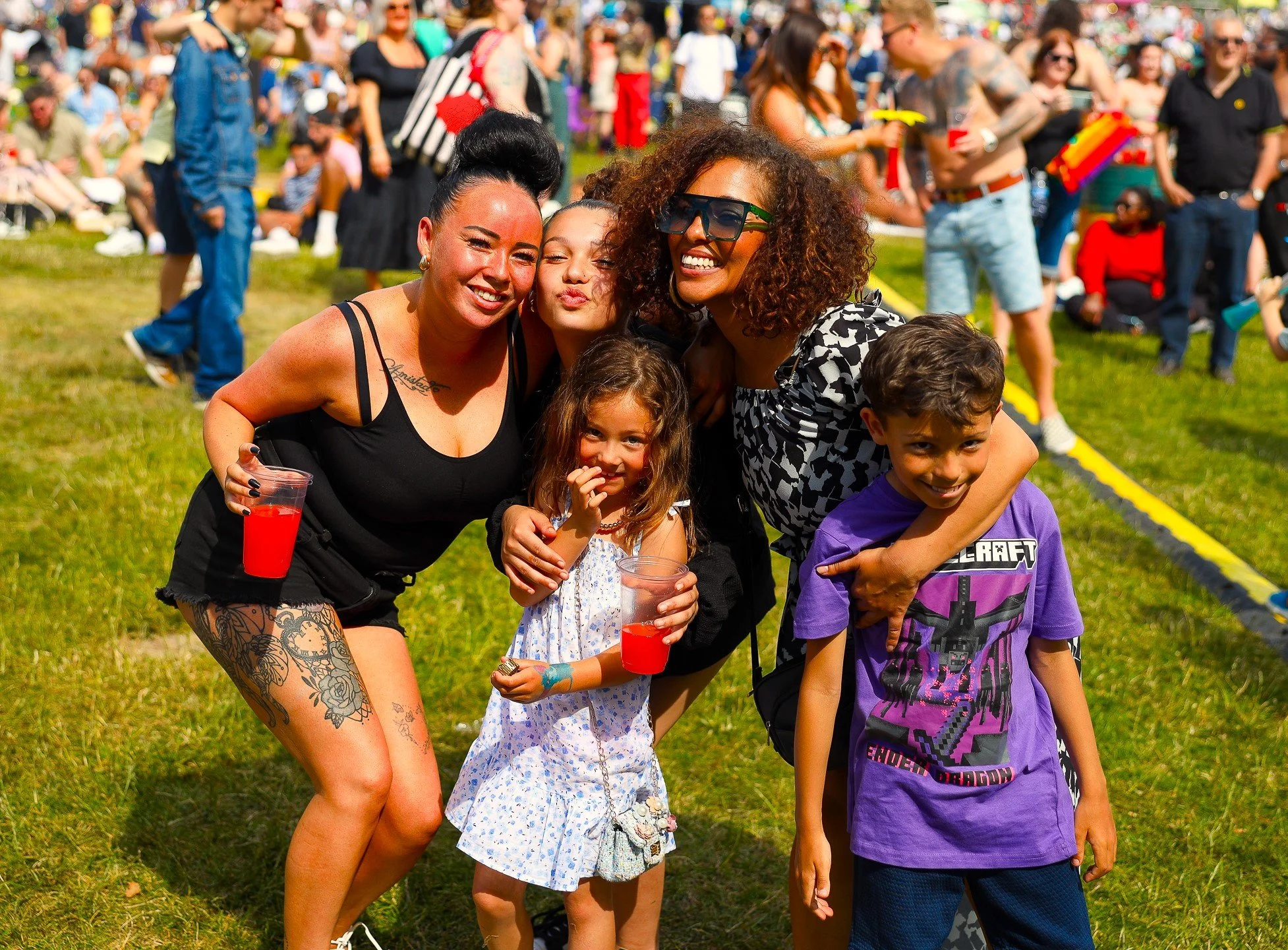
Over 100,000 festival goers
Over 100,000 festival goers

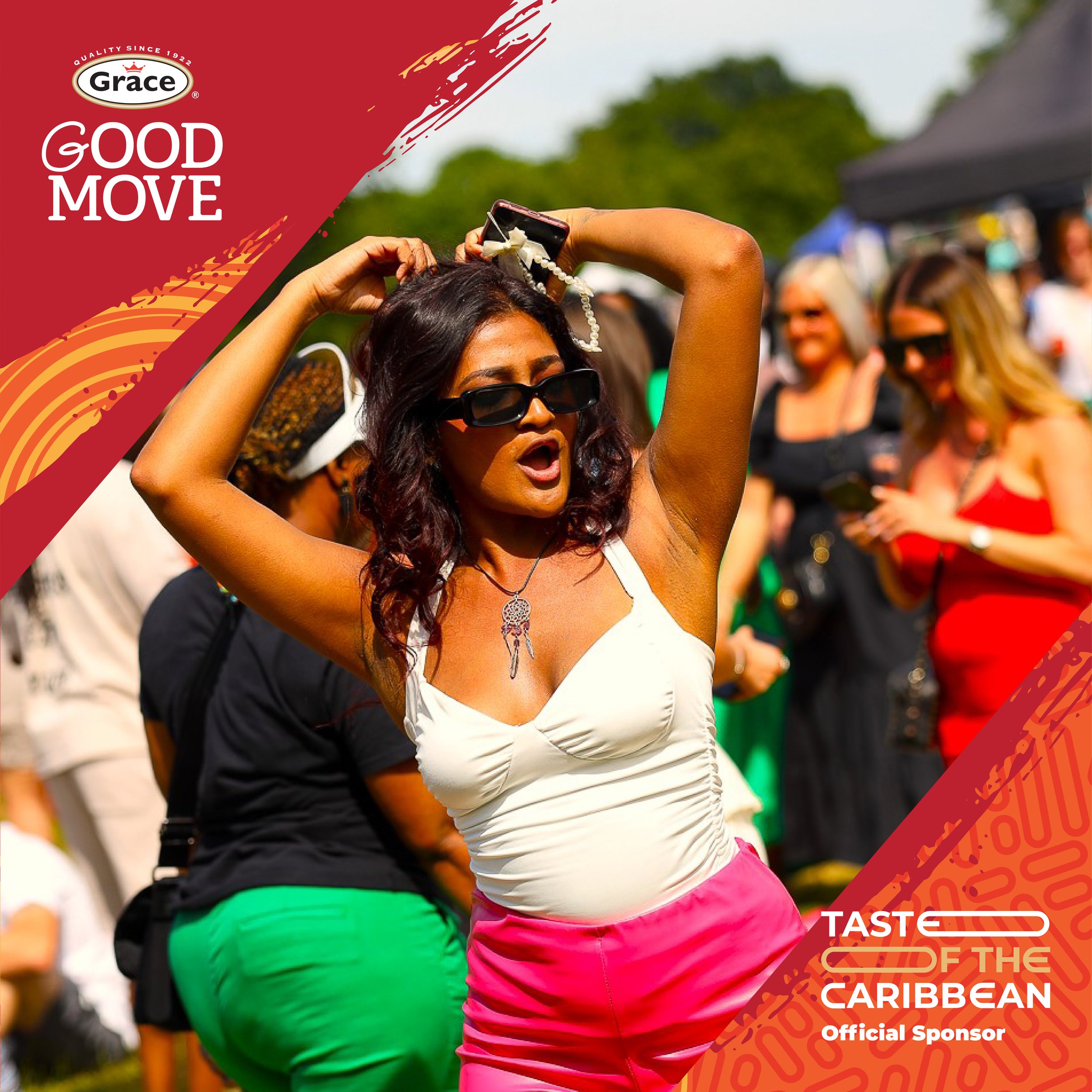
Brand Collaborations – Grace, Carib, and Duppy Share
Graphic design work for brand partners Grace, Carib, and Duppy Share merged each brand’s heritage with the overarching festival aesthetic, ensuring seamless visual harmony across collaborative activations. Each design celebrates Caribbean authenticity while amplifying brand presence within the festival landscape.
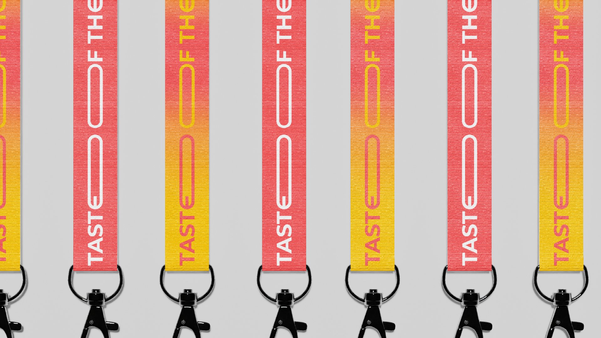
Festival Assets – Lanyards and Wristbands
The wristbands and lanyards were designed as both practical tools and visual extensions of the festival identity, using colour, texture, and pattern to reflect the joyful rhythm of the Caribbean. These small-scale assets ensure brand cohesion and enhance the attendee experience through visual and tactile engagement.

Bob Marley Statue – Research and Art Direction
The Bob Marley statue concept was guided by in-depth cultural and visual research to ensure respectful representation. Art direction focused on honouring Marley's legacy as a global Caribbean icon, integrating symbolism, posture, mannerisms and spatial context.


Roti Shack – Kiosk Identity Design
The Roti Shack kiosk identity was designed to reflect the warmth and authenticity of Caribbean street food culture, with a subtle nod to Guyana. Custom typography and vibrant graphics positioned the shack as both a culinary destination and a visual highlight.


Stage Design – Full Graphic Suite
The main stage design included graphics for the upper, lower, back wall, and side wings, forming a complete visual environment. This immersive backdrop framed performances and presentations with dynamic Caribbean-inspired visuals.


Alcoholic Island Slush – Kiosk Branding
Visual branding for the Alcoholic Island Slush kiosk used bright, juicy colour tones and playful graphic elements to evoke tropical refreshment. The design appeals to festivalgoers seeking fun and flavour in equal measure.
